Project Overview:
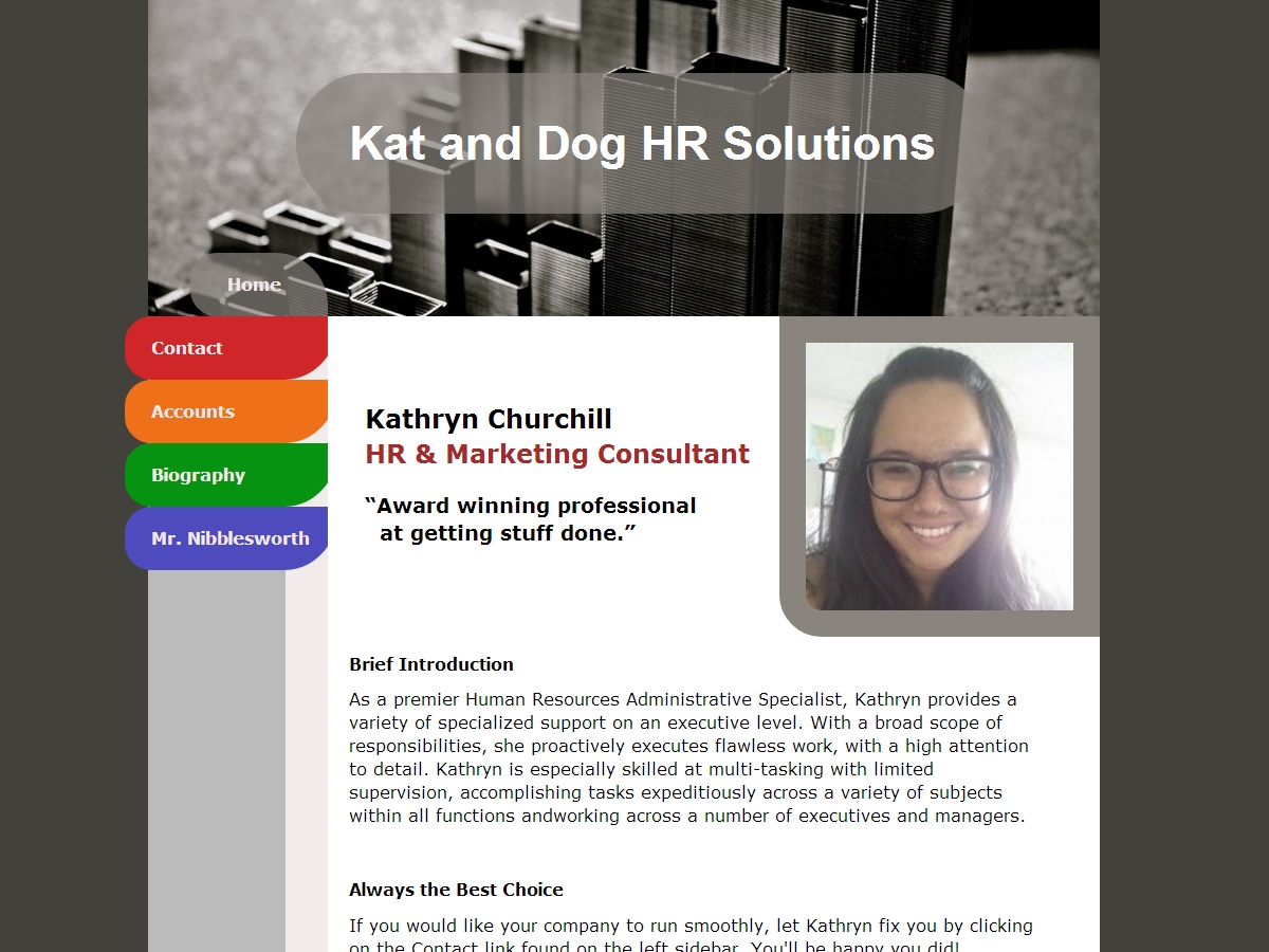
I made this site as a reflection of Kathryn's LinkedIn presence, and based the design and colors off of an abstract interpretation of office filing. I used this opportunity to practice readable, clear code structure meant for others to edit.
The Requirement:
- A website to use as a marketing portfolio to include with a resume.
- Easy to build off of in the future.
- Emphasis on simple & clean.
- Create color scheme without input.
- Does not utilize Wordpress, nor table-based formatting.
The Solution:
- Use divs instead of table structure.
- Keep size the same on every page for a simpler feel.
- Collect data from client's resume to decide overall look.
- Begin to outline mobile version for future release.
The Results:
A consistent, fast-loading, professional portfolio website.


